Big Data Analysis for the Rest of Us
Ok, we have all heard about Big Data. But we leave the techie stuff up to our highly skilled IT folks, in order to tame those massive volumes of information so we neophytes can make sense of it all. Enough has been written about the value of Big Data, so we won’t repeat the obvious here. The cold hard fact is that Big Data, when fully understood and properly analyzed, is a game changer for many HR organizations.
That’s just great when you have a fully staffed IT department waiting by the phone for you to call with a new analytics project request. Oh, they are busy right now? And maybe for the next few weeks or months? Sound familiar? Unfortunately, those of us that crave that big data analytics value proposition just didn’t graduate from college with a computer science degree. Humanities, psychology, business, accounting, maybe. I don’t know about you, but my form and analysis professor (music major here) never mentioned Big Data. Not once. Sonata Rondo form structure, yes. Big Data, no.
To be clear, serious analysis like that discussed in LBi’s recent whitepaper “The Power of HR Analytics in the Quantified Organization”, requires careful planning and execution. In order to answer tough questions such as “What drives high-performance sales teams?” “Who will be our best leaders?” “How can we change behavior to improve customer retention?”, we need IT to be all-in with HR. Big Data analytics in HR must encompass more and more non-HR data sets such as sales and supply chain data. Additionally, as the whitepaper suggests, by embedding these services within business process applications, real-time analytics with current data can readily accelerate management and executive decisions, thereby truly creating a competitive edge.
However, we may just occasionally be forced on our own to jump into the Big Data pile heap and figure it all out. It can be done. Trust me.
The answer lies in Microsoft Excel’s glorious Pivot Tables and Pivot Charts. Just one slightly techie skill. Not too much to ask.
Allow me to introduce these Excel features to you:
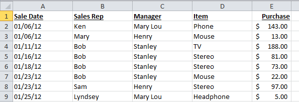
- Pivot Tables – Pivot tables summarize data that exists in list form, without the need to create formulas. For instance a raw list of sales data can be summarized by sales rep, by product, and by monthly revenue all in a single table view. See an example of the raw data and resulting pivot table below:
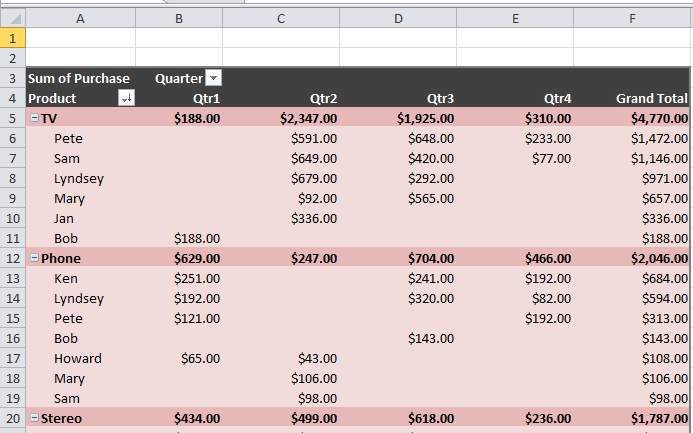
In this single table, you can quickly view which products brought in the most annual revenue, who the top sales people were, quarterly results by product and rep (Quarter grand totals were cut out for space considerations in this article), and more. This table was created in about 3 mouse clicks and a few drag and drops. Zero typing and no formulas. 2 minutes folks!
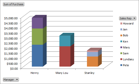
- Pivot Charts – Pivot tables displayed in graphical form.
These are just a few very basic examples of the power of Pivot Tables and Pivot Charts. That’s about it. Pivot Tables are easy to learn and a very powerful tool for basic analytics tasks.
How do you get started? Here are the simple steps to perform easy but powerful analytics for the novice.
- Determine exactly what data you want to analyze (be as specific as possible).
- Request an Excel copy of the necessary data you need from your IT department. This is an easy request for them and should not create a burden.
- Learn Pivot Table basics. Plenty of Excel for Dummies books out there. Grasping the basics should be easy – you can get fancy with your pivot tables and charts later.
- Start small and simple to get the hang of it.
- Impress your boss and ask for a raise!
For the mission critical decision making analytics, follow the advice of the HR experts quoted in our whitepaper “The Power of HR Analytics in the Quantified Organization”. For more day-to day analysis tasks, give Pivot Tables a whirl. You will be glad you did.
Happy analyzing!